Charts Seams in Avare
Avare’s charts are based on FAA charts. The charts distributed by the FAA are based on a legacy system that is still being printed on paper for sale to pilots! However, the FAA is also distributing them in a digital form with metadata allowing them to be associated with GPS coordinates. This is why creating Avare is possible!
Contents:
- The “national” sectional chart
- The challenge of stitching
- Reconciling conflicts
- The end result
- Found an issue?
See our FAA chart reference.
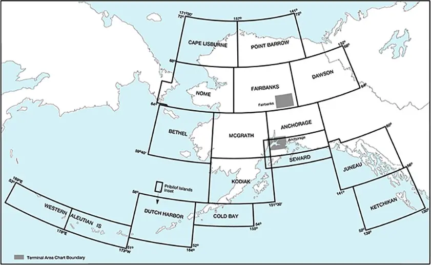
The “national” sectional chart
The “national” sectional chart, updated on a 56 day cycle, is assembled from 61 raster images.
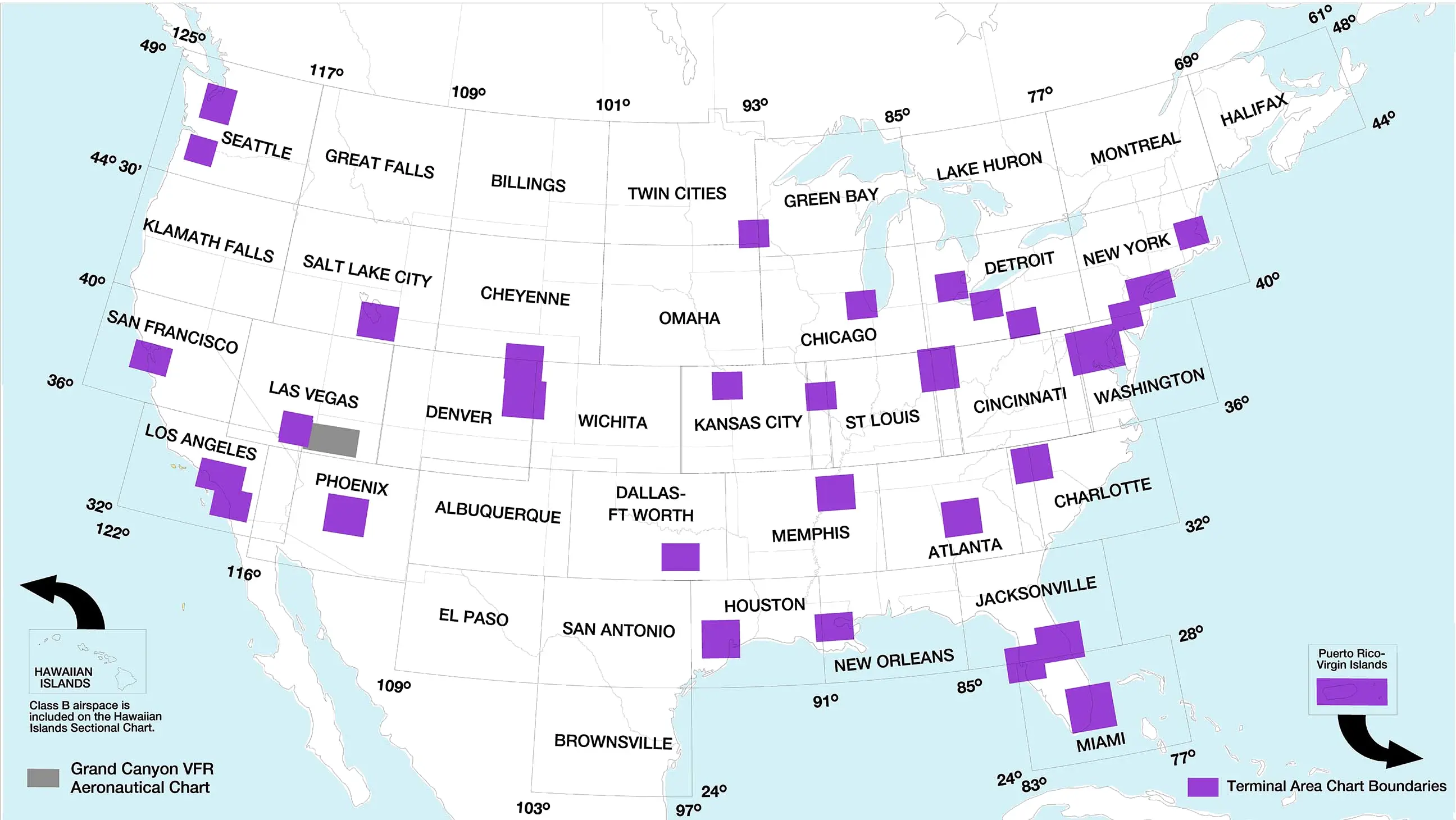
Though raster images are conceptually “simple” to crop, trim, and orient, this simplicity comes at a cost. The actual aviation data (airport identifies, frequencies, etc) is in image form rather than being searchable and editable data.
The 61 individual images are regularly updated by the FAA, having intersections and overlaps between charts. They are stitched together via a rough process illustrated below:
The challenge of stitching
Unfortunately, the underlying charts overlap each other, and the aviation data placement in the region of overlap is chosen for viewing only in one image. Hence, the actual aviation data (such as airport identifiers and frequencies) are not consistently placed among the images. For example, here is the intersection of:
- Chicago
- Detroit
- St Louis
- Cincinnati
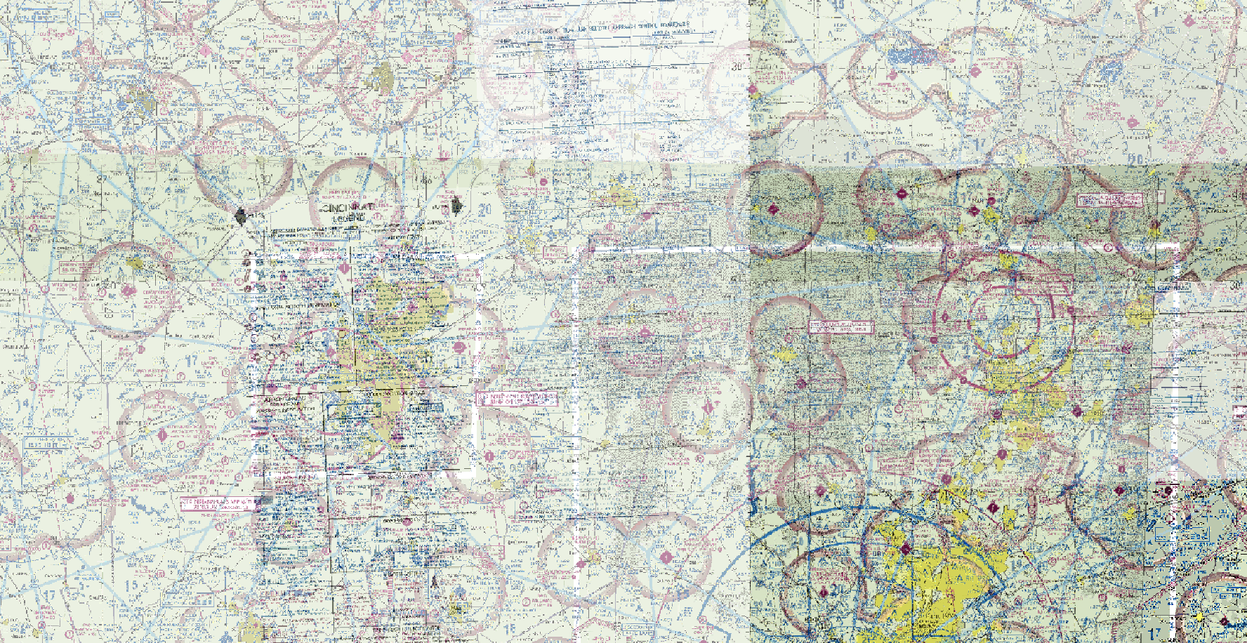
When the images are cropped and stitched together, the resulting image can have conflicts, i.e., some of the chart data is necessarily lost.
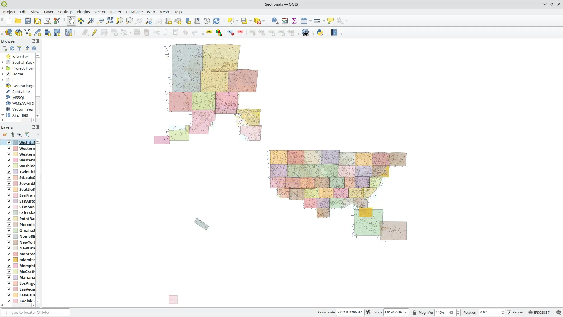
Reconciling conflicts
Reconciling the conflicts is a manual process. A long term
goal of the stitching process for Avare is to optimize the aviation
data capture. The following illustrates the stitching around Dayton
and Columbus OH: 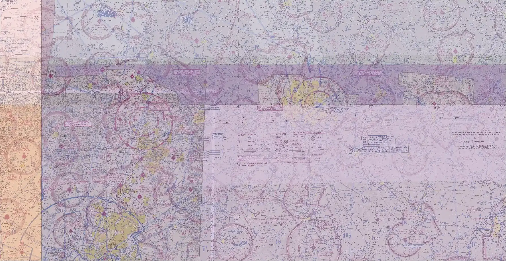
In this example, the stitching limits (overlayed translucent layers) wrap around Dayton and Columbus in an effort to capture the most essential data. (Ideally the stitching would visually pleasing (i.e., not be distracting to the eye, juxtaposed elements of the overlapping images should be harmonious rather than jarring.)
Stitching is a moving target, as the FAA alters the charts regularly.
Automation of the stitching process has (so far) been impractical. Further, it has also been impractical to monitor each airport/frequency/landmark/etc to make sure no critical data is trimmed. Since information that is missing is not easy to find (especially when it is not known to be missing), this process of finding sub-optimal stitch routing is like counting the needles in the haystack to make sure the number is correct (and then doing it again 56 days later).
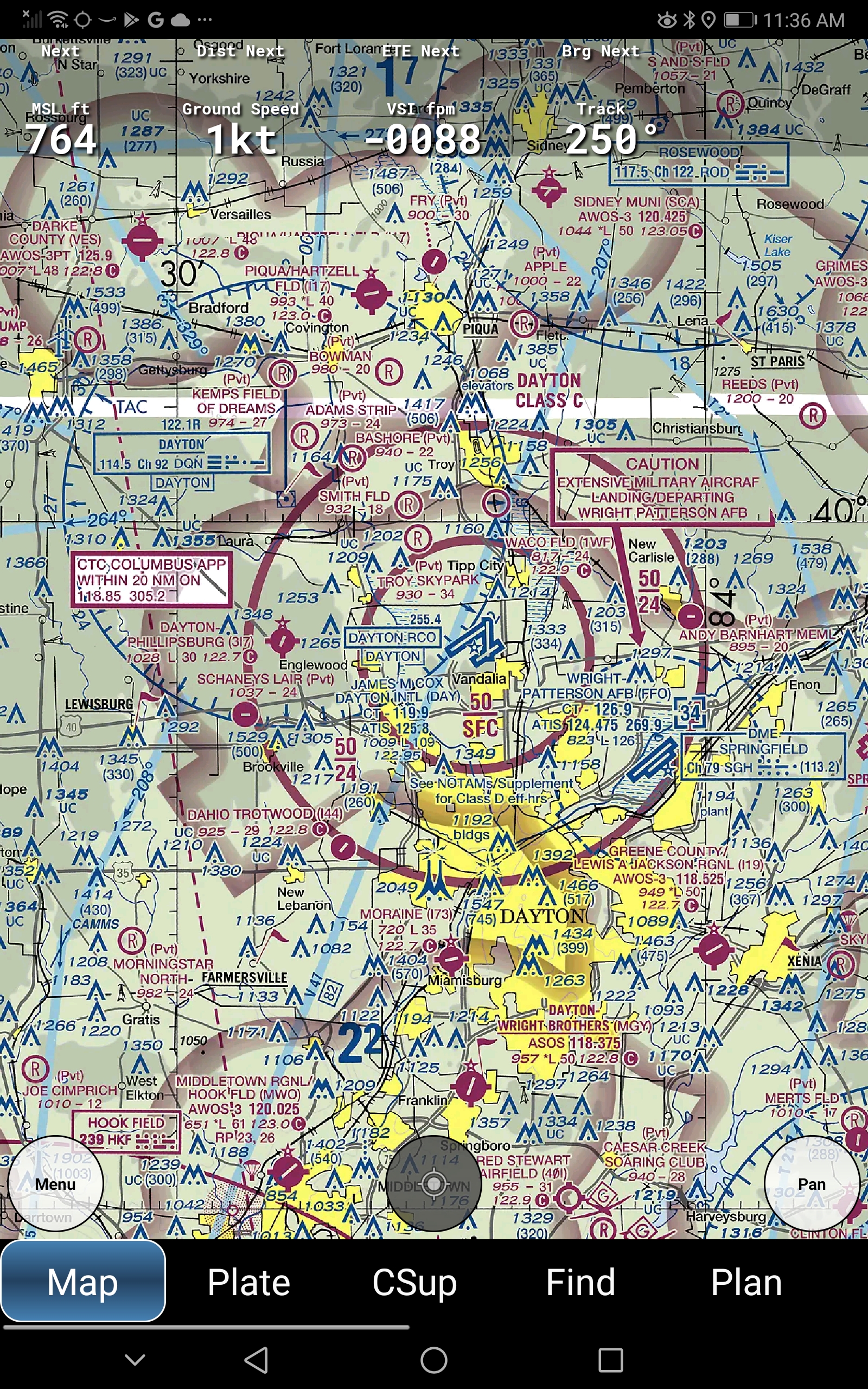
The end result
The end result is a “national” sectional chart in Avare! All the Avare “national” charts (VFR, IFR, TAC, etc) are produced this way!
Found an issue?
We rely on users to report when there are issues. This can be done by making a suggestion in the forum. Ideally users would contribute fixes too! You can use QGIS and the Avare charts datasets.
